The IAFA Prompt Framework: Four Boxes Between a Grey Button and a Great One
PART 3 OF 11 · THE VIBE CODING COURSE
New here? Start at Part 1 →
Ask an AI for “a cool cyberpunk button” and you will get a grey rounded rectangle that says CLICK ME.
Ask for the same thing in four labelled boxes and you get a black panel with cyan lettering, a pink glow, and a glitch on hover. Same model. Same afternoon. The difference is entirely in how the request was written.
The short version
IAFA is a four-box structure for saying what you want: Identity, Audience, Function, Aesthetic. It takes about ninety seconds to fill in and it improves the output more than switching to a better model. The reason it works is unglamorous — every box you leave empty is a decision handed to the model, and models resolve ambiguity toward the average.
I teach this to students who have never written code. It is the single change that most reliably turns disappointing output into something worth keeping.
Why vague prompts produce grey buttons
A model asked for something “cool” has to decide what cool means. It has seen millions of buttons and it will give you the centre of that distribution — the safest, most common, least surprising option.
That is not the model failing. That is the model doing exactly what you asked. You supplied one adjective and it filled in every other decision on your behalf, conservatively.
So the fix is not a magic phrase or a better model. It is removing the decisions you did not mean to delegate.
The four boxes
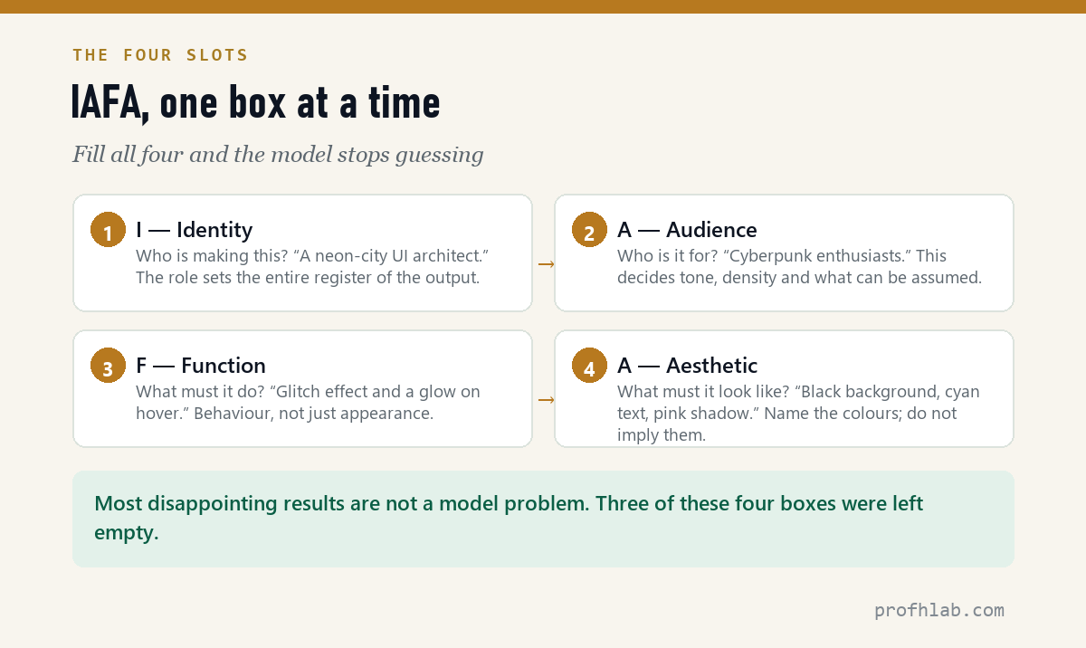
| Box | The question it answers | Example |
|---|---|---|
| I — Identity | Who is making this? | A neon-city UI architect |
| A — Audience | Who is it for? | Cyberpunk enthusiasts |
| F — Function | What must it do? | Glitch effect, glow on hover |
| A — Aesthetic | What must it look like? | Black background, cyan text, pink shadow |
Identity sets the register of everything that follows. “A neon-city UI architect” and “a government accessibility consultant” will produce different work from an identical brief, because you have told the model which body of practice to draw from.
Audience decides tone, density and what can be assumed. Writing for cyberpunk enthusiasts means you can skip the explanation and lean into the style; writing for first-time visitors means the opposite.
Function is behaviour, not appearance — what happens when someone hovers, clicks, scrolls, or gets it wrong. This is the box people most often skip, and it is why so much AI output looks fine and does nothing.
Aesthetic is where you name things instead of implying them. “Modern” is not an aesthetic; “black background, cyan text, pink shadow” is. If you know the colours, say the colours.
freeCodeCamp.org (11.8M subscribers) on prompt engineering in general. IAFA is a specialisation of what this covers. 2,748,585 views as of 11 August 2026.
The same request, twice
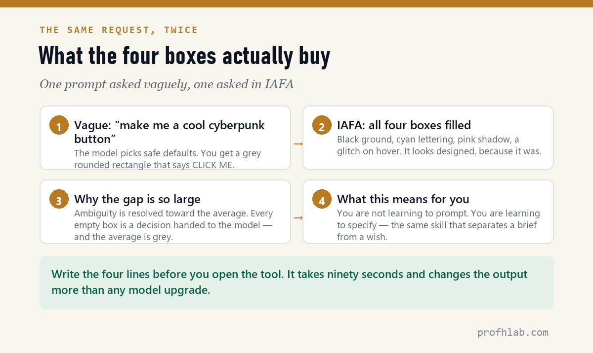
This is the demonstration I run in class, because arguing about prompt quality is less persuasive than showing two results side by side.
Approach 1 — vague

“Make me a cool cyberpunk button.”

Result: a grey rounded rectangle reading CLICK ME.
Approach 2 — IAFA

Identity:  A neon-city UI architect
Audience:  Cyberpunk enthusiasts
Function:  Glitch effect, glow on hover
Aesthetic: Black background, cyan text, pink shadow

Build a single button to that brief.

Result: black panel, cyan lettering, pink glow, glitch on hover.
The second one looks designed because it was designed — by you, in four lines, before the model saw anything.
Your blank template
Copy this. Fill it in before you open the tool.
Identity:  [who is making this — a role, not a name]
Audience:  [who it is for, and what they already know]
Function:  [what it must DO — behaviour, states, edge cases]
Aesthetic: [colours, type, spacing, mood — be specific]

[Then your actual request, in one sentence.]
Ninety seconds. That is the entire cost.
The test that tells you it is working
Read your four lines back and ask: could two different people build meaningfully different things from this? If yes, you have left a box too vague, and the model will resolve it toward the average. If no, you have written a brief.
Where it applies beyond buttons
The structure is not about design. It is about removing ambiguity, so it transfers.
- Writing. Identity: a plain-spoken technical editor. Audience: managers with no engineering background. Function: must survive being skimmed. Aesthetic: short paragraphs, no jargon, no exclamation marks.
- Data work. Identity: a careful analyst. Audience: a board that distrusts charts. Function: must show the trend and the uncertainty. Aesthetic: one colour, no gridlines, labelled endpoints.
- A whole site. Same four boxes, one level up — and then again per page. This is how the portfolio projects in this course were built.
The three mistakes I see most
- Filling Aesthetic and leaving Function empty. You get something beautiful that does nothing on hover, nothing on error, nothing on a phone. Function is the box that separates a picture from a product.
- Writing adjectives instead of specifics. “Modern, clean, professional” describes half the internet. If three different designs satisfy your description, it is not a description.
- Filling all four boxes and then not checking the result. A good brief improves the odds. It does not remove your job — which is still to look at what came back and say what is wrong with it.
What a semester of this actually showed
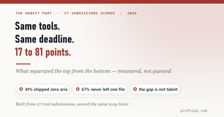
I did not arrive at these four boxes by theory. I built them for a university course and taught them to 57 students across two sections last semester — 27 in one class, 30 in the other — most of whom had never written a line of code before the first week.
The pattern that emerged was not subtle. The students who wrote the clearest briefs shipped the best sites, and it had remarkably little to do with how much syntax they had learned. Across both sections the same pattern held: two students with nearly identical technical ability produced work of very different quality, and the difference was traceable to whether they filled the four boxes before opening the tool or after.
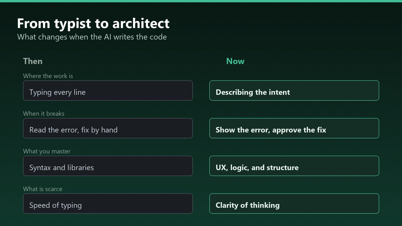
For thirty years, learning to build for the web meant learning where the semicolon goes. That part is now largely handled. What is scarce is the ability to say exactly what you want, to a machine, without hand-waving. The IAFA boxes are just the architect’s drawing.
Where the four boxes sit in the whole loop
The prompt is stage two of four. Most people start at stage three and wonder why the output feels generic.
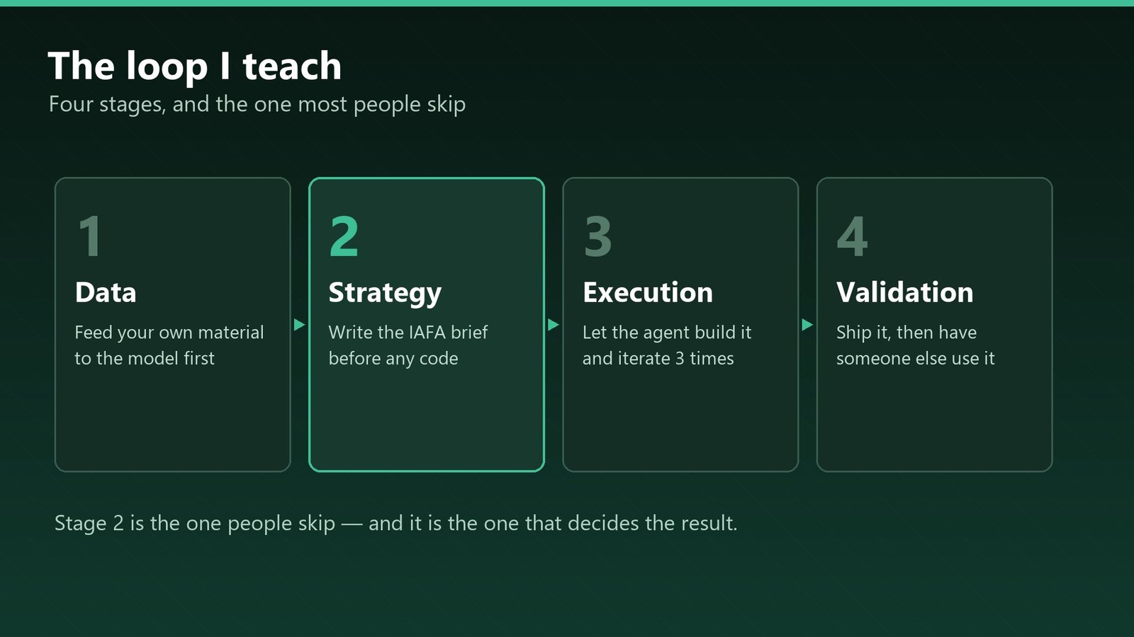
Stage four matters more than it looks: in class, every project had to be used by someone who was not its author. That is where “obvious” navigation turns out not to be obvious. If you are working alone, hand it to one person who has never seen it and watch without explaining anything.
The same discipline applies to tools that act rather than write — see when to use agentic AI and when a checklist still wins. And if you are choosing which assistant to run this on, the current prices are on the AI Price Tracker, verified weekly; the free tier is usually enough for this kind of build.
Jeff Su (1.85M subscribers) has an eight-minute formula that overlaps closely with the Function box above. 3,683,562 views as of 11 August 2026.
How IAFA differs from “act as” prompts, and what if you’re unsure
Does IAFA work on every model?
Yes, because it is not a trick that exploits one model’s behaviour. It is a way of writing an unambiguous brief, which helps any system — and any human — that has to interpret it.
Is this the same as “act as a…” prompting?
Identity is that idea, but it is one box of four. The common failure of role-play prompting is stopping there: you set a persona and then leave function and aesthetic to chance.
What if I do not know what I want yet?
Then fill in the boxes you can and mark the rest as open, explicitly: “Aesthetic: undecided — give me three directions.” Deliberate ambiguity is fine. Accidental ambiguity is what produces grey buttons.
Does this replace iteration?
No. It gets your first draft close enough that iteration becomes refinement rather than rescue.
How do I write a prompt for a website specifically?
Fill the four boxes and hand them over as four labelled lines rather than one paragraph. Identity: whose site this is and what a visitor should feel. Audience: who arrives, on what device, knowing what. Function: everything it must do — including “must work on a phone,” the line beginners leave out most often. Aesthetic: name the colours, the type, the density, because “modern” is not a description. Then add one sentence that is not about design at all: return one complete index.html with inline CSS and JavaScript, no build step.
The one-line version
You are not learning to prompt. You are learning to specify. That is the same skill that separates a brief from a wish, and it was valuable long before any of this existed.
Next in this series: what to do when the output looks right and is not — the verification habit that 52% of developers skip.
IAFA is the framework I developed for teaching agentic tools to beginners. The before-and-after example above is from the course material.
THE AGENTIC AI SERIES
Eleven articles, in order
- 1. Generative AI vs Agentic AI — One writes the answer, the other does the job.
- 2. What Is Vibe Coding, Really? — The shift from worker to conductor.
- 3. The IAFA Prompt Framework — Four boxes between a grey button and a great one. (you are here)
- 4. Your First Page in Ten Minutes — No install, no account, one file.
- 5. From a File to a Live URL — Three routes, and which ones survive a year.
- 6. An Honest Agent Benchmark — 76 seconds to a draft, then two failures.
- 7. Verify Before You Ship — Four passes, with three failures I actually hit.
- 8. The 100-Point Scorecard — Grade your own site before anyone else does.
- 9. Adding a Database — A file cannot remember anything.
- 10. When Vibe Coding Fails — Same tools, same deadline, 17 to 81 points.
- 11. Teaching Vibe Coding — A 15-week course, and what I would change.
Start at the Agentic AI library.
Prof.’s H Newsletter
One short email a month, with the numbers in it
What actually moved in AI hiring, AI prices, and the scams aimed at older Americans. Counted here, dated, and linked to the source. One email a month, and your address goes nowhere else.