The 100-Point Scorecard: Grade Your Own Site Before Anyone Else Does
PART 8 OF 11 · THE VIBE CODING COURSE
New here? Start at Part 1 →
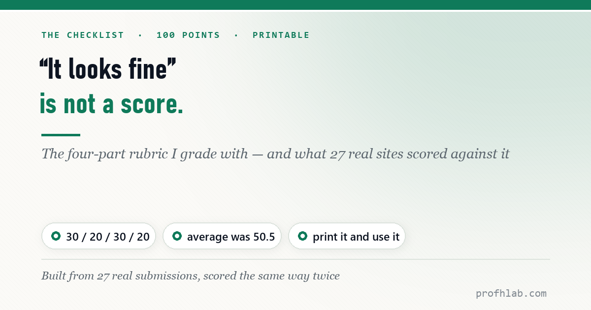
“It looks fine” is not a judgement. It is the absence of one.
Here is the rubric I actually grade with, the numbers 27 real sites scored against it, and a printable version you can mark up before you send your link to anyone whose opinion matters.
The four parts
Visual design & UX — 30. Technical functionality — 20. Content & storytelling — 30. Responsive & accessibility — 20.
Design and content carry the most weight because they are what a visitor experiences. Functionality and accessibility carry less — but they are where almost everyone loses points, for a reason worth understanding.
What 27 real sites scored
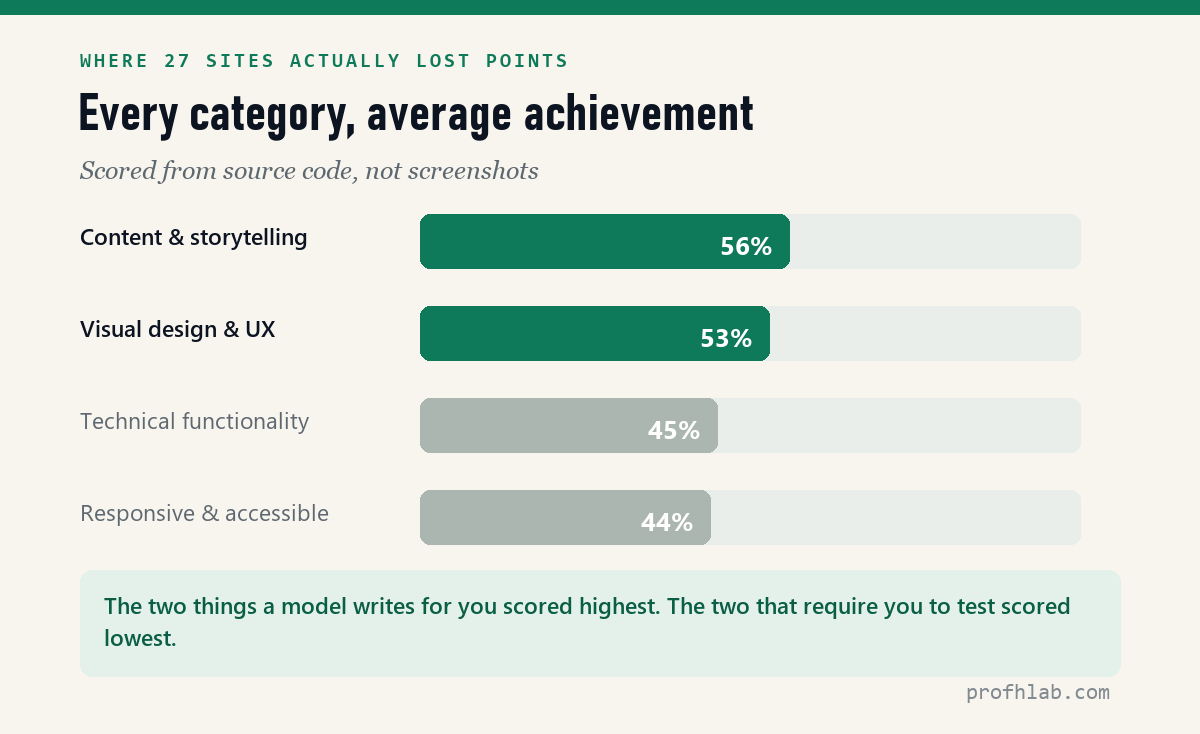
These are not hypothetical numbers. Twenty-seven sites, built in one course, same tools, same deadline — scored from their source code rather than from screenshots.
| Category | Average achieved |
|---|---|
| Content & storytelling | 56% |
| Visual design & UX | 53% |
| Technical functionality | 45% |
| Responsive & accessibility | 44% — lowest |
| Overall average | 50.5 / 100 (highest 81.4, lowest 17.3) |
Look at the order. The two categories that a model will write for you unprompted — the words and the look — scored highest. The two that require you to go and check something scored lowest. That pattern is the entire argument of this series in one table.
The four parts, and what each is really asking
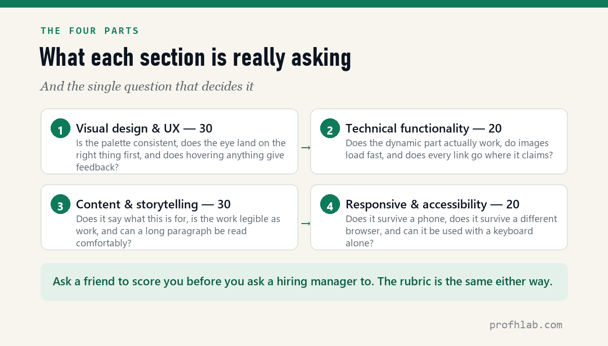
1. Visual design & UX — 30 points
- Consistency. One palette, one type scale, applied the same way everywhere. Most amateur sites fail here by having three of each.
- Visual hierarchy. The most important thing on each screen is what the eye reaches first. If everything is emphasised, nothing is.
- Micro-interaction. Buttons respond to hover. Transitions feel deliberate. This is what separates “a page” from “a product.”
2. Technical functionality — 20 points
- Dynamic features. If it stores or submits anything, that works reliably — not once, on your machine.
- Loading speed. Images sized for the web. Nothing that blocks the page for seconds.
- Navigation. Every link goes where it claims. Nobody gets stranded.
3. Content & storytelling — 30 points
- Fitness for purpose. A stranger understands what this is and who it is for, within ten seconds.
- Portfolio quality. Each project says what it was, what you did, and how it turned out. Not just a picture.
- Readability. Type size and line spacing make a long paragraph comfortable rather than a chore.
4. Responsive & accessibility — 20 points
- Mobile. Nothing overflows, nothing overlaps, every control is thumb-sized.
- Browser compatibility. Checked in more than the one browser you built it in.
- Accessibility. Images have alt text. The whole site works with a keyboard alone.
Print it and mark it up
I made a two-page scorecard with every line above as a checkbox, a space for each section score, and what the total means. Download the scorecard (PDF, 2 pages) — free to print and share.
Nielsen Norman Group (320K subscribers) on heuristic evaluation — the discipline this rubric is a simplified, gradeable version of. 212,654 views as of 11 August 2026.
How to use it without fooling yourself
- Score it on a phone first. Not your laptop. Most of the points you are about to lose live there.
- Do the accessibility line with your hands off the mouse. Tab through the whole site. If you cannot reach something, it scores zero, however pretty it is.
- Give the content section to someone else. You cannot judge whether a stranger understands your page in ten seconds. A stranger can.
- Fix your lowest section, not your best one. Going from 44% to 70% in accessibility moves the total more than polishing a 53% design to 60%.
What the total means
| 80 and above | Send it. Stronger than most first portfolios. |
| 60–79 | Good. One weak section is holding it back — the rubric just told you which. |
| 40–59 | It looks finished and is not. Usually functionality or accessibility. |
| Under 40 | Go back to the brief. The problem is upstream of the code. |
For calibration: the 27-site average was 50.5. That is a room full of people who all thought their site looked fine.
The procedure itself, from the same group. 43,190 views as of 11 August 2026.
Why accessibility gets only 20 of the 100 points
Is this rubric objective?
Partly. Functionality and accessibility can be measured almost mechanically — does the form validate, does tab reach everything, are there media queries. Design and content need a human. That is why the scorecard asks you to hand one section to someone else.
Can I use it for client work?
Yes, and it is more useful there than for a portfolio, because it converts “I don’t love it” into a line item somebody can act on.
Why is accessibility only 20 points?
Because this rubric was written to grade a first web project, not to certify compliance. If your site is a public service or a business, accessibility deserves far more weight — and a proper audit, not a checklist.
What should be on a checklist before launch?
The four sections above, in this order of likely damage: does every link go where it claims, does it survive a phone, can it be operated with a keyboard alone, and does a stranger understand what the site is for within ten seconds. Across 27 real sites the last one was the easiest to pass and the first three were where the points went.
How do I evaluate someone else’s website with this?
Score it from the outside in, the way a visitor actually meets it: open it on a phone first, then a laptop; click before you read; look at the source only at the end. Scoring from screenshots inflates design and hides functionality — and functionality is the category that separated the strongest group from the weakest by 3.6×.
Next
The lowest-scoring category was functionality, and the single biggest reason is that a static page cannot remember anything. That is the next article — what changes when your site needs to store something, and what it costs you.
THE AGENTIC AI SERIES
Eleven articles, in order
- 1. Generative AI vs Agentic AI — One writes the answer, the other does the job.
- 2. What Is Vibe Coding, Really? — The shift from worker to conductor.
- 3. The IAFA Prompt Framework — Four boxes between a grey button and a great one.
- 4. Your First Page in Ten Minutes — No install, no account, one file.
- 5. From a File to a Live URL — Three routes, and which ones survive a year.
- 6. An Honest Agent Benchmark — 76 seconds to a draft, then two failures.
- 7. Verify Before You Ship — Four passes, with three failures I actually hit.
- 8. The 100-Point Scorecard — Grade your own site before anyone else does. (you are here)
- 9. Adding a Database — A file cannot remember anything.
- 10. When Vibe Coding Fails — Same tools, same deadline, 17 to 81 points.
- 11. Teaching Vibe Coding — A 15-week course, and what I would change.
Start at the Agentic AI library.
Prof.’s H Newsletter
One short email a month, with the numbers in it
What actually moved in AI hiring, AI prices, and the scams aimed at older Americans. Counted here, dated, and linked to the source. One email a month, and your address goes nowhere else.